

Economic analysis requires systematic interpretation of theoretical models, graphical data, and mathematical relationships demonstrating how markets function, prices form, and resources allocate, essential competencies transforming descriptive summaries into rigorous analytical work, which universities reward with distinction grades.
Economics isn’t memorising definitions. It’s understanding relationships.
Supply meets demand. Costs determine output. Policies shift markets.
University economics assignments test whether you can analyse models, interpret graphs, and apply frameworks to real scenarios. Descriptive answers earn passes. Analytical answers earn distinctions.
This comprehensive guide shows you exactly how to analyse economic models and graphs as professional economists do.
Understanding Economic Models: The Foundation
Economic models are simplified representations of complex real-world phenomena, isolating specific variables whilst holding others constant through the ceteris paribus assumption, “all other things being equal,” enabling systematic analysis of cause-and-effect relationships.
Models aren’t reality. They’re analytical tools revealing how economic forces operate when distractions are removed.
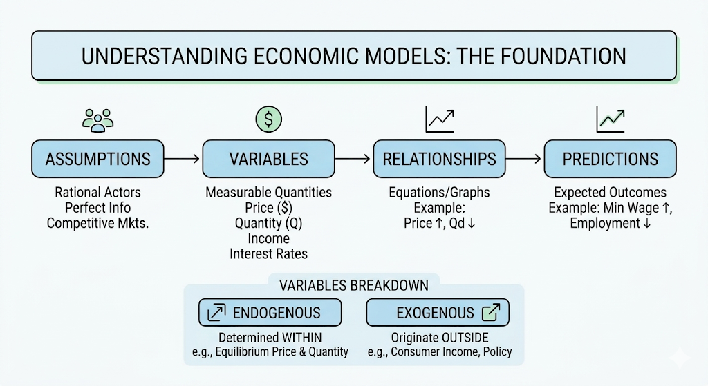
Every economic model contains four fundamental components:
Assumptions establishing the boundaries and simplifications making the analysis tractable. Examples: rational actors, perfect information, competitive markets.
Variables representing measurable quantities that change. Examples: price, quantity, income, interest rates.
Relationships showing how variables connect through equations, graphs, or logical statements. Example: “As price rises, quantity demanded falls.”
Predictions stating expected outcomes when conditions change. Example: “Increasing minimum wage will reduce employment in competitive labour markets.”
Understanding variable types is crucial:
Endogenous variables are determined within the model through calculations. In supply-demand models, equilibrium price and quantity are endogenous. They result from the model’s internal logic.
Exogenous variables originate outside the model but influence outcomes. Consumer income, technology levels, and government policies are typically exogenous. They’re given conditions affecting endogenous results.
Step-by-Step: Analysing Supply and Demand Models
Supply and demand is economics’ most fundamental model. Master this and understand how markets work.
Step 1: Identify the market
What’s being bought and sold? Be specific. Not “food,” “organic vegetables in urban farmers’ markets.” Not “labour,” “skilled software developers in London.”
Step 2: Draw the initial equilibrium
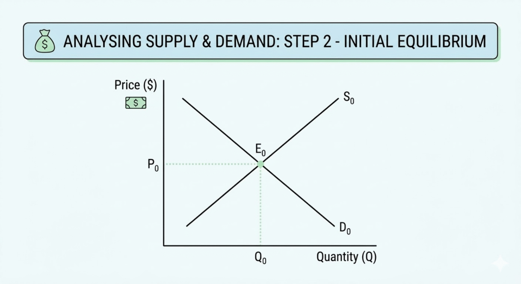
Plot price on the vertical axis, quantity on the horizontal axis. Draw downward-sloping demand (consumers buy more at lower prices) and upward-sloping supply (producers sell more at higher prices). Mark where they intersect. That’s equilibrium.
Step 3: Identify what changed
Did an exogenous variable shift? Examples:
- Consumer income changes (shifts demand)
- Production costs change (shift supply)
- Consumer preferences change (shift demand)
- Technology improves (shifts supply)
- Related good prices change (shifts demand or supply)
Step 4: Determine which curve shifts and in which direction
Demand shifters:
- Income increases –> demand shifts right (for normal goods)
- Substitute prices rise –> demand shifts right
- Complement prices rise –> demand shifts left
- Consumer preferences strengthen –> demand shifts right
Supply shifters:
- Input costs rise –> supply shifts left
- Technology improves –> supply shifts right
- Number of sellers increases –> supply shifts right
- Taxes increase –> supply shifts left
Step 5: Find the new equilibrium
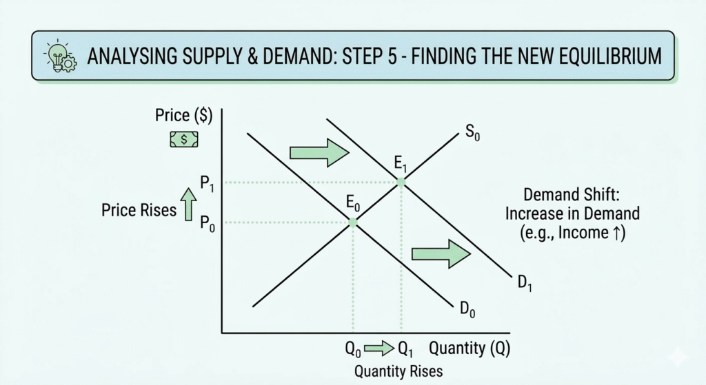
Where do the new curves intersect? Compare the new equilibrium price and quantity to the original values. This is your analytical conclusion.
Step 6: Explain the economic logic
Don’t just describe what happened. Explain why.
For example:
“Demand increased because rising consumer incomes enabled greater purchasing power. At the original price P₀, quantity demanded now exceeds quantity supplied, creating a shortage. Price rises to P₁, incentivising greater production whilst rationing demand until markets clear at new equilibrium Q₁.”
Struggling with identifying which curves shift or determining new equilibrium positions? Our economics homework help connects you with qualified economists who demonstrate proper graphical analysis techniques across microeconomic and macroeconomic models, ensuring your assignments showcase the analytical precision and distinction-level work demands.
Interpreting Graph Components: Slopes, Intercepts, and Areas
Economic graphs communicate quantitative relationships. Understanding what different graphical elements mean is essential.
Reading Slopes
The slope measures how much one variable changes when another changes by one unit.
The demand curve slope shows how quantity demanded responds to price changes. Steeper slopes mean less responsive (inelastic) demand. Flatter slopes mean more responsive (elastic) demand.
The Production Possibilities Frontier (PPF) slope reveals opportunity cost. The slope shows how many units of one good must be sacrificed to produce one additional unit of another good.
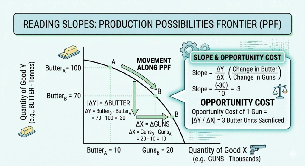
Calculate slopes numerically:
The fundamental formula to calculate slope is:
Slope = (Change in Y) ÷ (Change in X)
For demand:
If price increases from £10 to £12 whilst quantity falls from 100 to 80 units:
Slope = (12 – 10) ÷ (80 – 100) = 2 ÷ (-20) = -0.1
This means each £1 price increase reduces quantity demanded by 10 units.
Understanding Intercepts
The y-intercept (vertical axis intercept) shows the value when the X variable equals zero.
On a demand curve, the Y-intercept is the maximum price consumers would pay (choke price), where quantity demanded reaches zero.
On a cost curve, the Y-intercept represents fixed costs. Costs are incurred even when production is zero.
X-intercept (horizontal axis intercept) shows the value when the Y variable equals zero.
On a demand curve, the X-intercept is the maximum quantity demanded when the price is zero (free goods).
Calculating Areas
Areas under curves or between curves represent economic values.
Consumer surplus is the triangular area between the demand curve and the equilibrium price line, showing the difference between what consumers are willing to pay and what they actually pay.
Producer surplus is the triangular area between the supply curve and the equilibrium price line, showing the difference between what producers receive and their minimum acceptable price.
Deadweight loss is the triangular area representing lost surplus when markets operate below efficient equilibrium (e.g., due to taxes, price controls, or monopoly power).
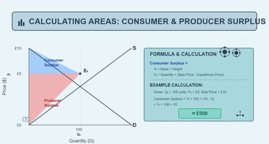
Calculate consumer surplus:
Consumer Surplus = ½ × Base × Height = ½ × Quantity × (Maximum Price – Equilibrium Price)
Example: If the equilibrium quantity is 100 units, the equilibrium price is £5, and the maximum price (Y-intercept) is £15:
Consumer Surplus = ½ × 100 × (15 – 5) = ½ × 100 × 10 = £500
Distinguishing Movements Along Curves vs. Shifts of Curves
This distinction is the most common requirement in economics assignments. Getting it wrong costs major marks.
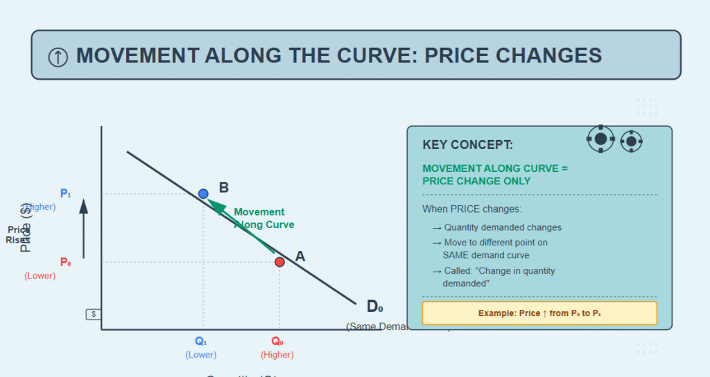
Movement Along the Curve
A movement along the curve occurs when the variable on the axis changes, causing movement to a different point on the same curve.
Demand curve: When the price changes, quantity demanded changes, moving along the existing demand curve. This is called a “change in quantity demanded.”
Supply curve: When price changes, quantity supplied changes, moving along the existing supply curve. This is called a “change in quantity supplied.”
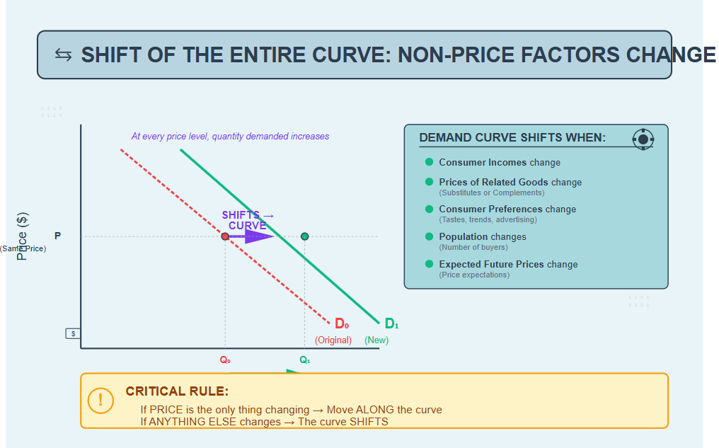
Shift of the Entire Curve
A shift of the curve occurs when a non-price factor (exogenous variable) changes, altering the relationship between price and quantity at every price level.
Demand curve shifts when:
- Consumer incomes change
- Prices of related goods change
- Consumer preferences change
- Population changes
- Expected future price change
Supply curve shifts when:
- Input costs change
- Technology changes
- Number of sellers changes
- Taxes or subsidies change
- Expected future price change
Microeconomic Applications: Firm Behaviour and Market Structures
Microeconomics analyses individual decision-making units, including consumers, firms, and specific markets.
Profit Maximisation
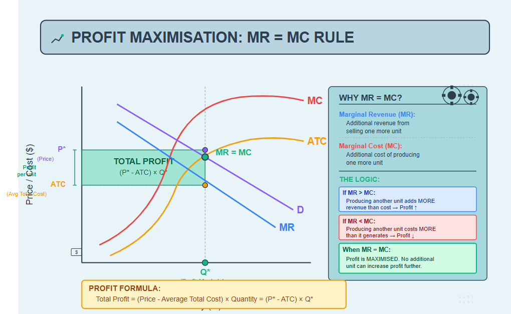
Firms maximise profit where Marginal Revenue (MR) equals Marginal Cost (MC).
Marginal Revenue is the additional revenue from selling one more unit.
Marginal Cost is the additional cost of producing one more unit.
Why MR = MC maximises profit:
If MR > MC, producing another unit adds more revenue than cost. Profit increases.
If MR < MC, producing another unit costs more than it generates. Profit decreases.
Only when MR = MC is profit maximised. No additional unit can increase profit.
Step-by-step profit maximisation analysis:
Step 1: Identify the market structure (perfect competition, monopoly, oligopoly, monopolistic competition).
Step 2: Draw relevant curves:
- Marginal Cost (MC) – typically U-shaped
- Average Total Cost (ATC) – U-shaped, above MC
- Demand (D) – downward-sloping
- Marginal Revenue (MR) – below demand for monopolies, equal to demand for perfect competition
Step 3: Find where MR = MC. This determines optimal output quantity Q*.
Step 4: Draw a vertical line from Q* to the demand curve. This determines price P*.
Step 5: Calculate profit = (P* – ATC) × Q*. If price exceeds average total cost, the firm earns economic profit (shaded rectangle).
Market Structure Analysis
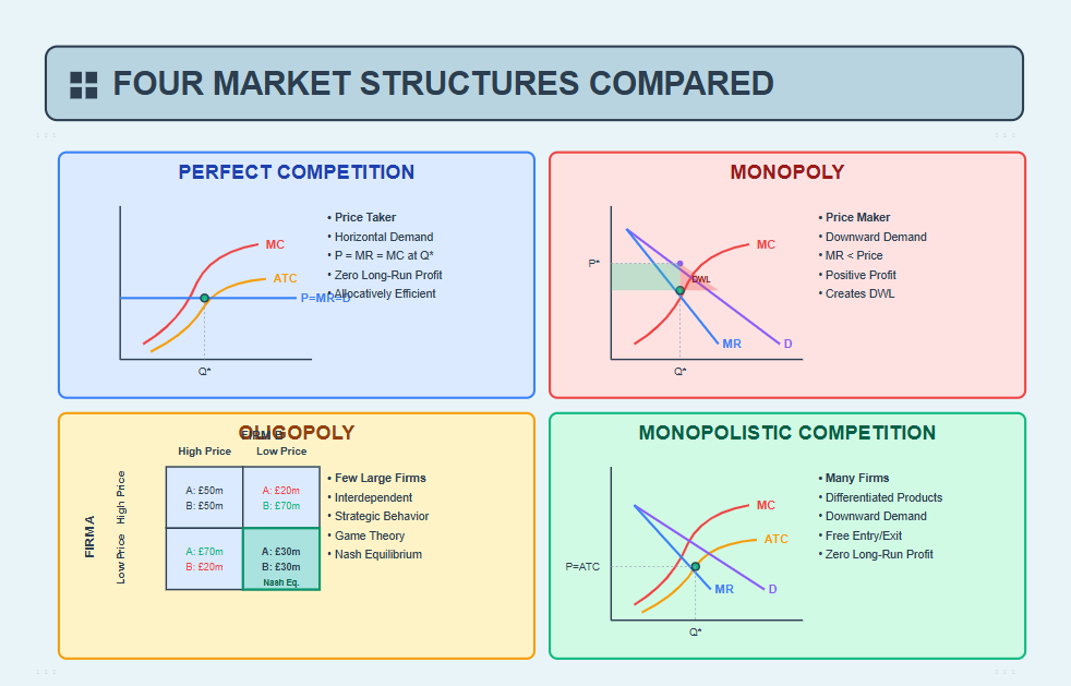
Perfect competition: Many firms, identical products, free entry/exit. Firms are price-takers. Long-run economic profit = zero.
Monopoly: Single seller, unique product, barriers to entry. The firm is a price-maker. Can earn long-run economic profit. Creates deadweight loss (inefficiency).
Oligopoly: Few large firms, interdependent decisions. Analysed using game theory matrices showing strategic choices.
Monopolistic competition: Many firms, differentiated products, free entry/exit. Short-run profit possible, long-run profit = zero.
When market structure analysis or calculating deadweight loss seems complex, our economics assignment help specialists demonstrate proper application of cost curves, revenue functions, and efficiency analysis across all market types, transforming confusion into distinction-level comprehension.
Macroeconomic Applications: Aggregate Models
Macroeconomics analyses the economy as a whole, focusing on national income, price levels, and employment.
The AD-AS Model
The Aggregate Demand-Aggregate Supply model is macroeconomics’ primary analytical framework, showing relationships between the overall price level and total output (real GDP).

Aggregate Demand (AD) represents total spending in the economy across 4 components, including the following:
- Consumption (household spending – largest component, ~60-70% of GDP)
- Investment (business capital spending, residential construction)
- Government spending (public sector purchases)
- X – M Net exports (exports minus imports)
AD shifts right when: Government increases spending, the central bank cuts interest rates, consumer confidence rises, foreign incomes increase (boosting exports), and the currency depreciates.
AD shifts left when: Taxes increase, interest rates rise, consumer confidence falls, and recessions abroad reduce exports.
Short-Run Aggregate Supply (SRAS) shows total production at different price levels, assuming some input prices are sticky (don’t adjust immediately).
SRAS shifts right when: Input costs fall, productivity improves, and favourable supply shocks occur.
SRAS shifts left when: Input costs rise (e.g., oil price shocks), natural disasters reduce capacity.
Long-Run Aggregate Supply (LRAS) is vertical at potential output, the economy’s maximum sustainable production level at full employment.
LRAS shifts right when: Labour force grows, capital stock increases, technology advances.
Analysing Economic Shocks Using AD-AS
Demand shock example: The government increases spending
Step 1: Initial equilibrium at E₀, where AD₀ intersects SRAS and LRAS.
Step 2: Increased government spending shifts AD right to AD₁.
Step 3: Short-run equilibrium moves to E₁, higher output (Y₁) and higher price level (P₁). The economy experiences economic expansion and inflation.
Step 4: Long-run adjustment: Higher prices eventually increase input costs, shifting SRAS left until the economy returns to potential output, but at a permanently higher price level.
Supply shock example: Oil price spike
Step 1: Initial equilibrium at E₀.
Step 2: Rising oil prices shift SRAS left to SRAS₁.
Step 3: New equilibrium E₁ shows lower output (Y₁) and higher prices (P₁)—stagflation (stagnation + inflation).
Step 4: Policy response options: The government could increase AD (risking more inflation) or wait for input prices to fall naturally.
The IS-LM Model
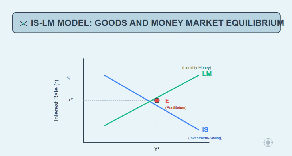
The IS-LM model analyses the interaction between goods markets (IS curve) and money markets (LM curve), determining equilibrium interest rates and national income.
The IS curve (Investment-Saving) shows combinations of interest rates and income levels where the goods market is in equilibrium (planned spending equals output).
The IS curve slopes downward: Higher interest rates reduce investment spending, lowering equilibrium income.
The LM curve (Liquidity preference-Money supply) shows combinations where the money market is in equilibrium (money demand equals money supply).
LM curve slopes upward: Higher income increases money demand; interest rates must rise to restore equilibrium.
Equilibrium occurs where IS and LM intersect, determining both the equilibrium interest rate (r*) and the equilibrium income (Y*).
Elasticity: Measuring Responsiveness
Elasticity measures how much one variable responds to changes in another variable, essential for predicting real-world market outcomes.
Price Elasticity of Demand (PED)
PED measures the percentage change in quantity demanded resulting from a 1% price change.
Formula: PED = (% Change in Quantity Demanded) ÷ (% Change in Price)
Interpretation:
- PED > 1: Elastic demand (quantity very responsive to price)
- PED < 1: Inelastic demand (quantity not very responsive)
- PED = 1: Unit elastic (proportional response)
Graphically, Flatter demand curves are more elastic. Steeper curves are more inelastic.
Example calculation:
If price increases from £10 to £12 (20% increase) and quantity falls from 100 to 70 units (30% decrease):
PED = 30% ÷ 20% = 1.5 (elastic demand)
Why elasticity matters: Firms with inelastic demand can raise prices without losing much sales (increasing revenue). Firms with elastic demand lose substantial sales when raising prices.
Income Elasticity and Cross-Price Elasticity
Income Elasticity of Demand (YED) measures how quantity demanded responds to income changes.
YED > 0: Normal good (demand increases with income) YED < 0: Inferior good (demand decreases with income) YED > 1: Luxury good (demand increases faster than income)
Cross-Price Elasticity (XED) measures how demand for one good responds to price changes of another good.
XED > 0: Substitute goods (e.g., Coke and Pepsi) XED < 0: Complement goods (e.g., cars and petrol)
Common Economic Analysis Mistakes
Recognising errors transforms basic submissions into professional-quality work.
Mistake 1: Correlation vs. Causation
Just because two variables move together doesn’t mean one causes the other. Ice cream sales and drowning rates both rise in summer; ice cream doesn’t cause drowning; temperature is the common cause.
In assignments: Always explain causal mechanisms. Don’t just say “unemployment and crime correlate,” explain why unemployment might cause crime (reduced opportunity cost of illegal activity, financial desperation).
Mistake 2: Post Hoc Fallacy
Don’t assume that because event B followed event A, event A caused event B.
Example:
“The government implemented a new policy in January. GDP grew in February. Therefore, the policy worked.” This ignores that GDP might have grown anyway due to seasonal patterns or other factors.
Mistake 3: Fallacy of Composition
What’s true for individuals isn’t necessarily true for everyone collectively.
Example:
One person standing at a concert sees better. If everyone stands, no one sees better. An individual firm can increase market share by cutting prices. If all firms cut prices simultaneously, market shares remain unchanged, whilst all earn less profit.
Mistake 4: Confusing Movements and Shifts
Moving along a demand curve vs. shifting the demand curve are fundamentally different. Price changes cause movements. Everything else causes shifts.
Mistake 5: Ignoring Ceteris Paribus
Economic models hold other factors constant. When applying models, explicitly state your assumptions about what remains unchanged.
Writing a Professional Economic Analysis
Economic writing demands precision, not vagueness.
Use specific numbers, not vague quantities:
Wrong: “Demand increased a lot”
Right: “Demand increased by 15%, shifting the curve rightward from D₀ to D₁”
Wrong: “Prices rose significantly”
Right: “Prices increased from £50 to £58 per unit, a 16% rise”
Use definitive language, not hedging:
Wrong: “The demand curve might slope downward”
Right: “The demand curve slopes downward due to diminishing marginal utility”
Wrong: “This could potentially increase unemployment”
Right: “This increases unemployment from 5.2% to 6.7%”
Start with conclusions, then explain:
Wrong: “First we’ll look at supply, then demand, then find equilibrium, and finally conclude…”
Right: “Equilibrium price rises from £10 to £14 because increased consumer income shifts demand rightward whilst supply remains constant. Analysis proceeds as follows…”
Struggling with technical economic writing or graphical precision? Our best assignment writing service in the UK is here for you 24/7 and delivers economist-quality analysis demonstrating proper model application, accurate graph construction, and mathematically rigorous derivations, ensuring your work meets the professional standards distinction grades require.
Conclusion
Master these analytical techniques across supply-demand, production possibilities, cost curves, and aggregate models. Practice deriving equilibria manually before using software. Always quantify changes numerically rather than vaguely.
Stop submitting economic analysis you’re uncertain about.
Every graph you draw without confidence, every elasticity you calculate incorrectly, every curve shift you misidentify is costing marks you could easily earn with proper guidance. Economics isn’t about memorising formulas. It’s about understanding relationships and applying logic systematically. Our economics assignment help from qualified economists shows you exactly how to interpret models, construct accurate graphs, and develop the analytical thinking that assessors reward with top marks.
Your understanding matters more than grades alone. These are the skills employers value in finance, policy, and consulting careers. Get the expert support ensuring your economic analysis demonstrates professional competence, not amateur guesswork.